Design Project
Concept Book Portfolio
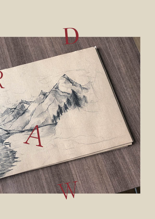
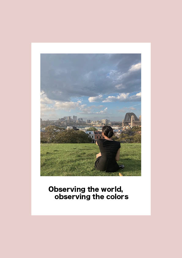
WK1 | STUDIO A
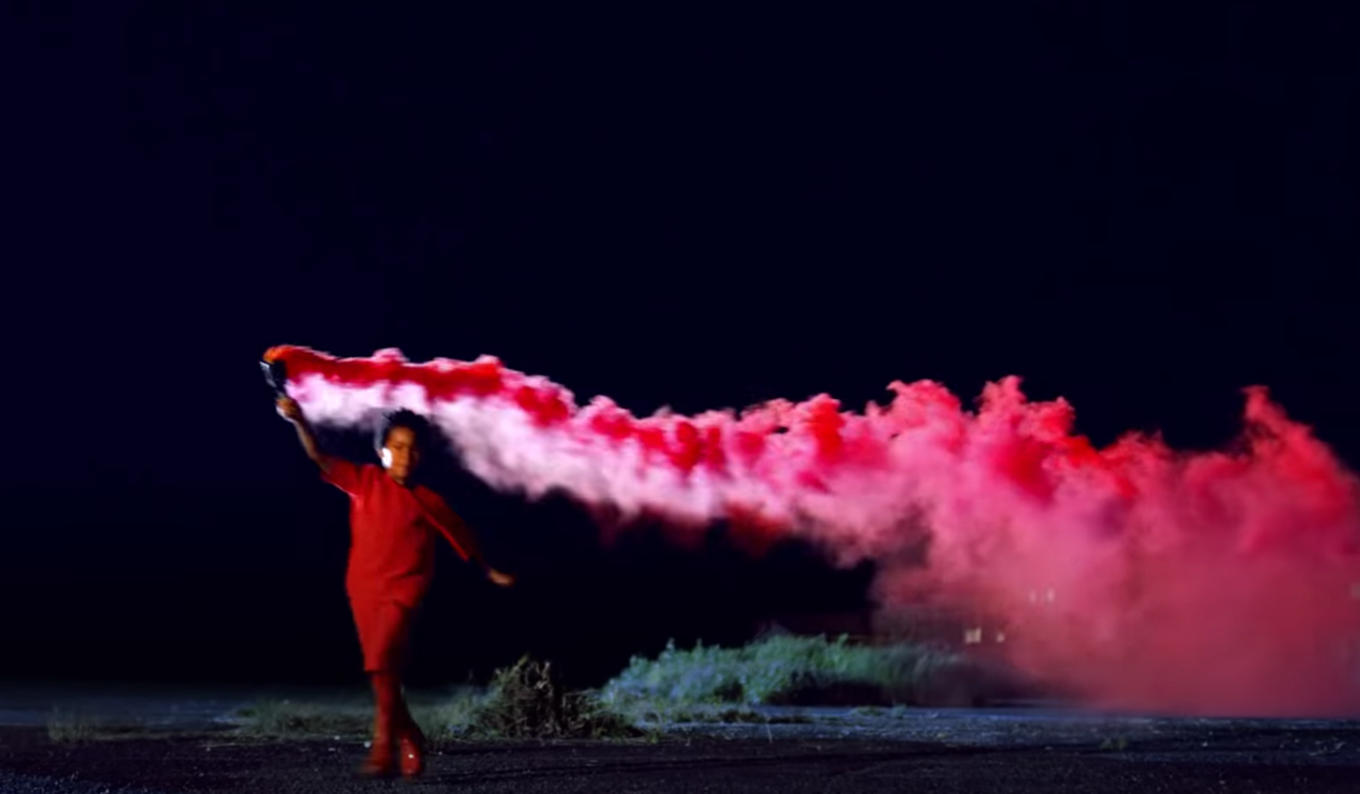
Reflective Practice (Kayne West)
It was impressive that themes such as love, racism, and human dignity were expressed figuratively using symbolic materials. The costumes were also produced with fairly high quality, creating a mysterious atmosphere rather than the unfamiliar feeling of makeup. Also, I liked the emphasis on the subject by bringing a strong impact and symbolism in color among the visual effects.
Stimulus Analysis
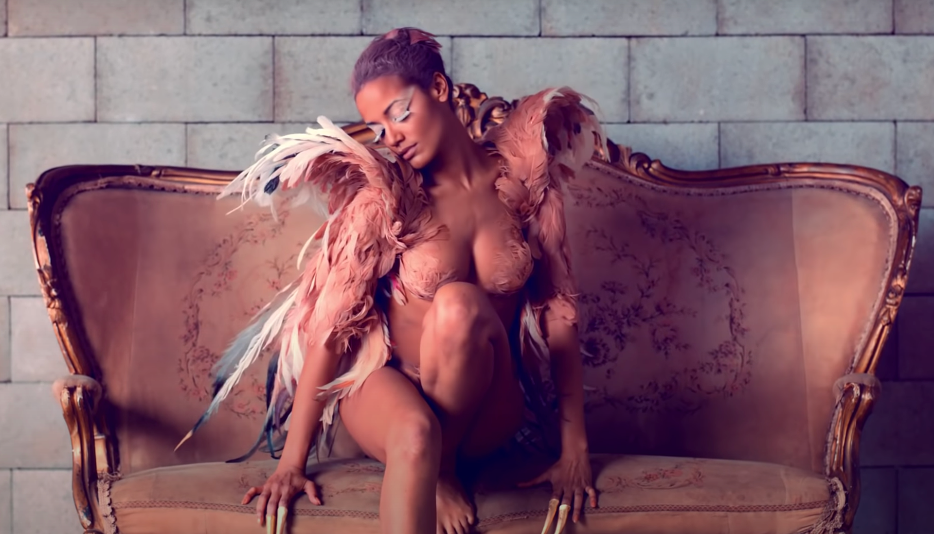
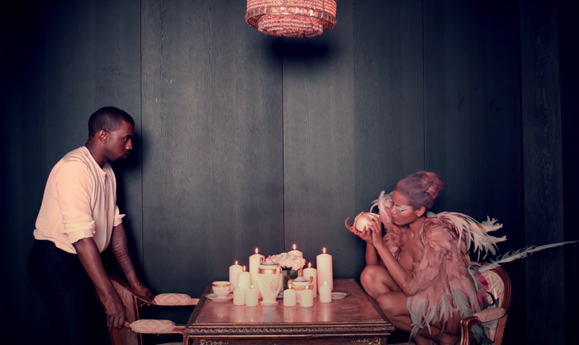
Stimuli # 2 The Tale of a Fairy 2011 motion picture, Walter Films, France
This video was created based on Chanel's fashion showcase 'Cruise Collection.' Three female performers portray a tragic and dark inner life that appears behind money, fame, and extravagant life. It also teaches us the lesson that satisfaction with life is not proportional to money. With the appearance of a female protagonist in the video, the video's entire atmosphere brings a dreamy and mysterious atmosphere with the feeling of having an unrealistic dream.
It is felt that the characters' luxurious and fancy casual and party costumes in the video provide an attitude in which tension lingers somewhere in line with the context of the opulence atmosphere.
Overall, the video's building, background, and costumes were used to unify the colors in white tones. Also, the main characters are wearing white-toned costumes. The incidental characters are wearing black-toned costumes. Using this contrast, the video's symbolism through color contrast can also be considered a design element. The scene in which the video's saturation is changed was also impressive in that it symbolically represented the change in the context in the video.
In addition, the bright, white-toned background, attractively tall characters, and fancy costumes in the video in a magnificent and luxurious home give me a sense of abundance and affluence. This atmosphere made me overwhelmed by the video, and I felt the yearning for a luxurious and elegant life. The dreamy and luxurious atmosphere in the video came to me attractively. The change of scene and description due to the change of color were also groundbreaking.
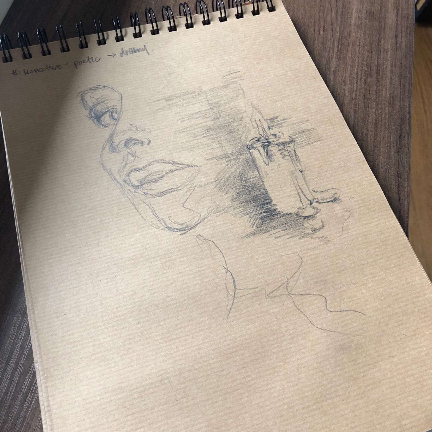
Narrative: culture
Lens: poetic
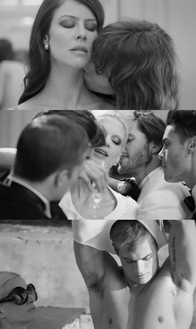
Stimuli # 4 Moffat, T 1994, Scarred For Life
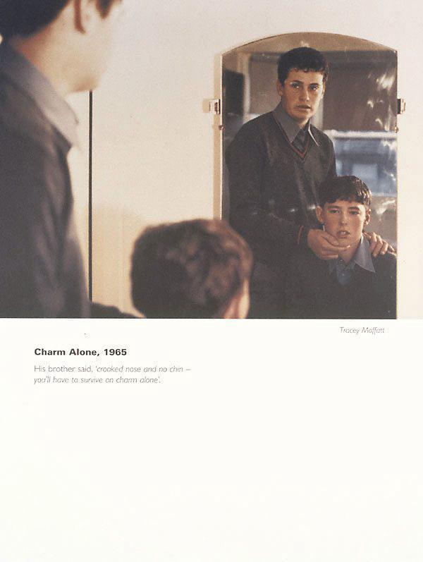
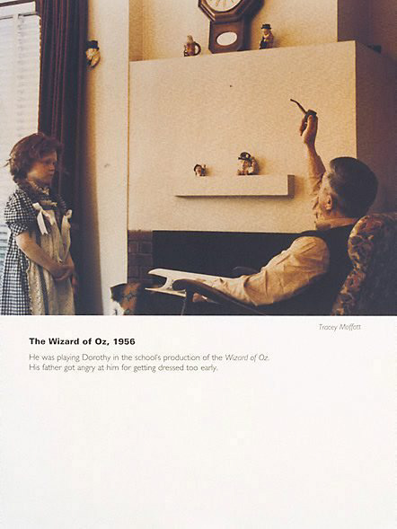
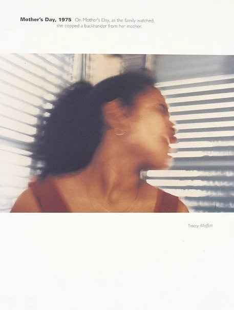
Her photographs mainly used faded colors and used paper, which was not mainly used for photographic prints in the United States at the time, to express a distinctive way of expression. At first glance, the pictures appear to be photographed in everyday life, but he accuses trauma, humiliation, and wounds of tragic and shocking moments in the description.
For example, in the picture "Charm alone," a man grabs a child's face and stares at a mirror. When the tense expression of a young boy in the photo, the somewhat aggressive look of the man, and the commentary at the bottom of the image, it seems as if they are accusing a personal attack's verbal violence within the patriarchal atmosphere. We can observe the small traumas and wounds in our daily family drama through these tense photos.
Also, "Mother's Day" is a picture taken when someone hits a woman on the cheek. This scene does not match the title' Mother's Day,' and it can be seen that it plays a role in aggravating the situation's trauma.
She also raised questions about the expression of sexual identity in photography. Her photography works are small events in my personal life but unconsciously evoke memories that have become traumas in my mind.
Narrative: social
Lens: critique
Narrative Lens /Methodical Lens
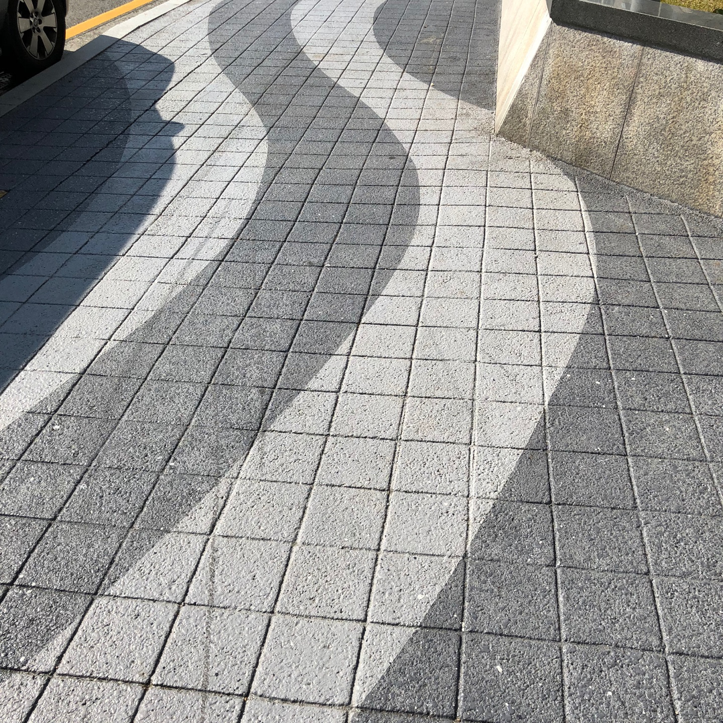
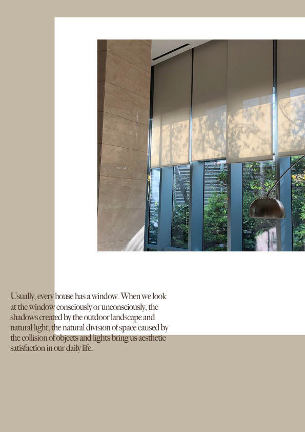
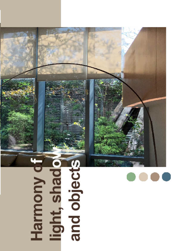
I explored what elements could visually express and interpret poetic aspects of everyday life through poetic and cultural lenses. I searched for anything special that could be found within the cultural background in which I live. The found materials were photographed harmoniously based on the surrounding light and shadow, and the aesthetic satisfaction was satisfied.
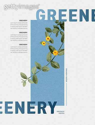
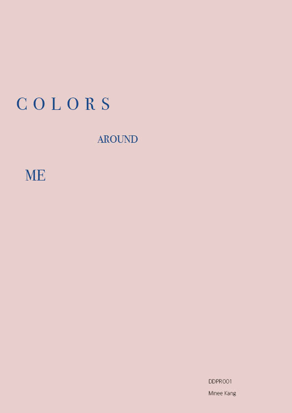
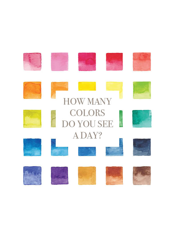
Concept | Interpretation
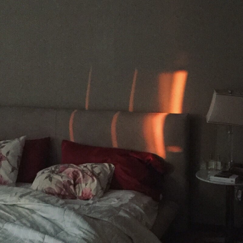
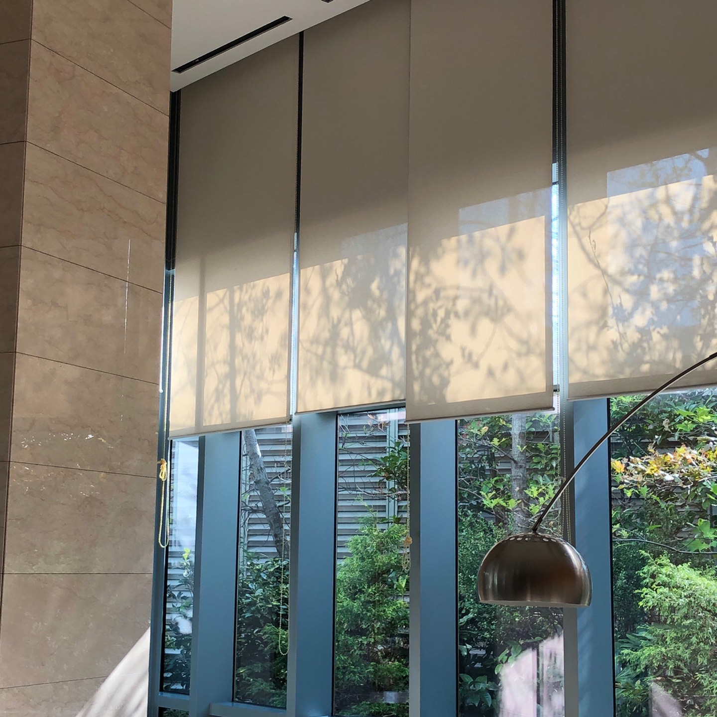
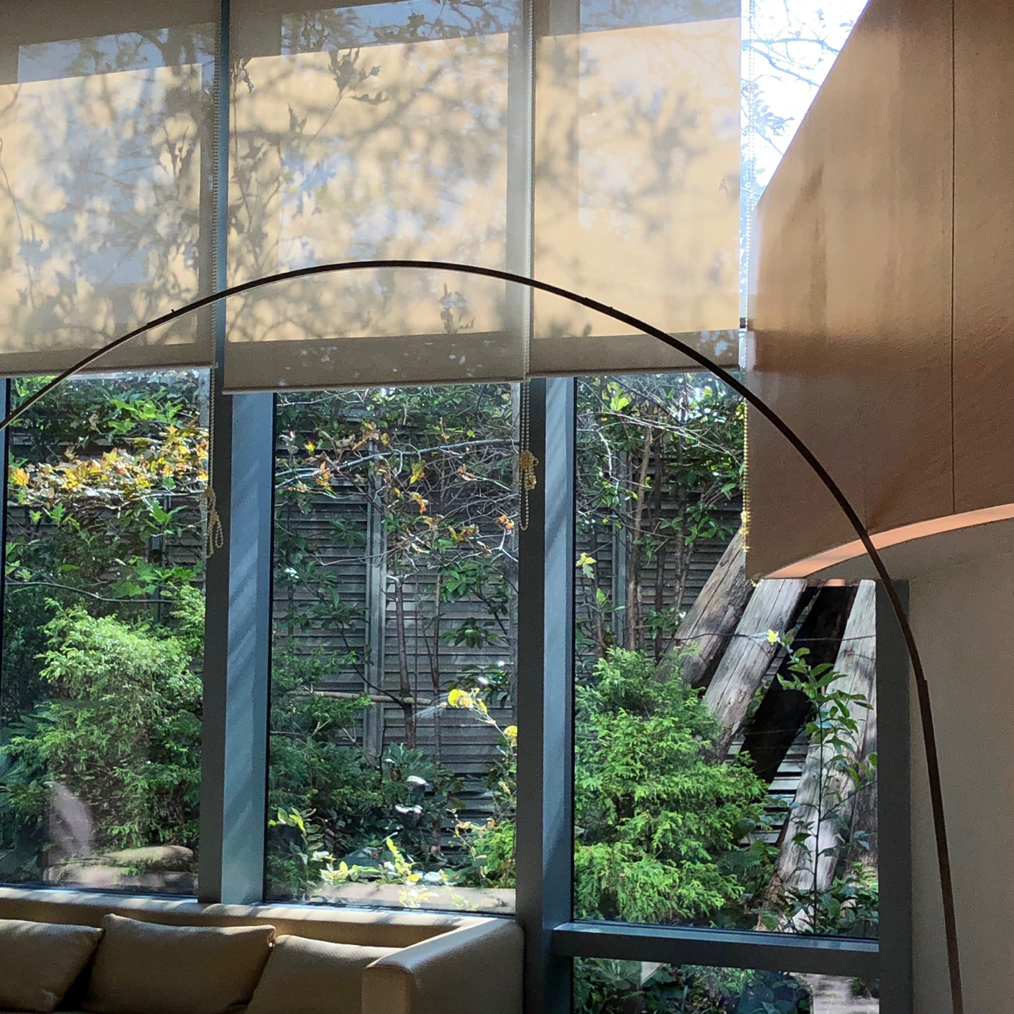
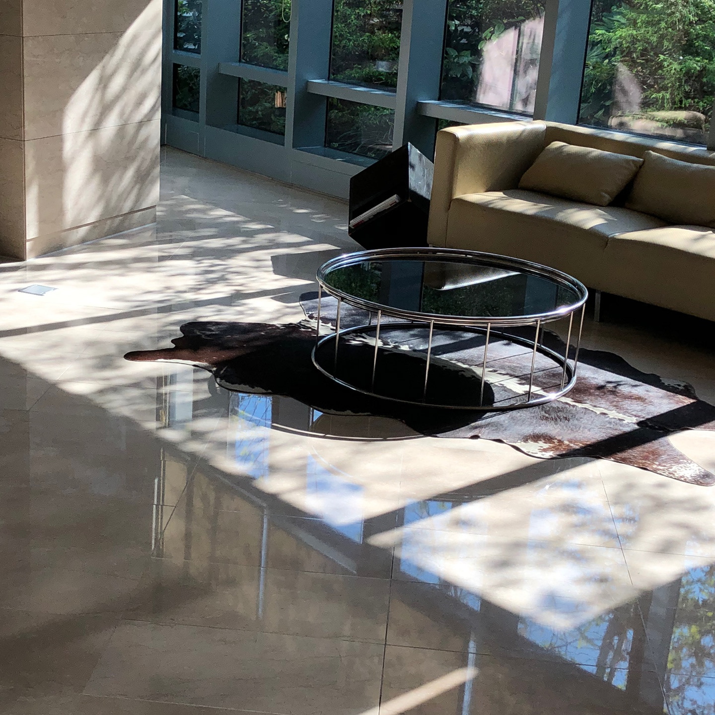
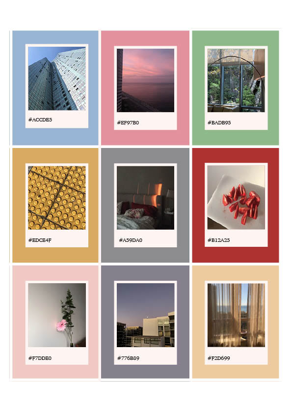
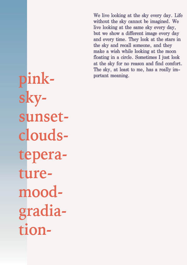
"colors around me"
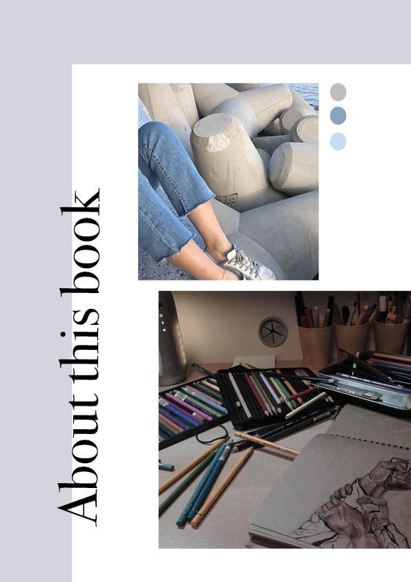
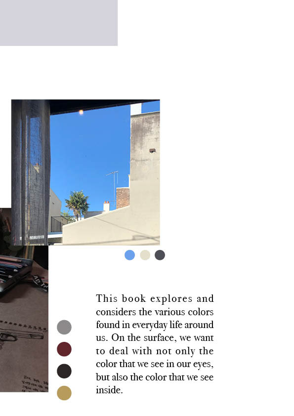
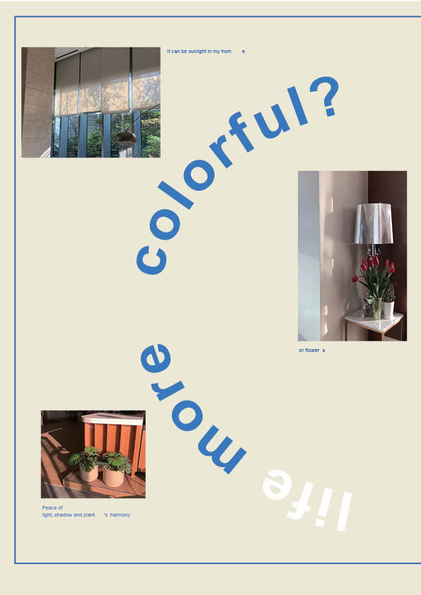
Based on photographs emphasizing light and color shadows, and exploring numerous visual elements that we observe or see in our lives, I have created a book that shows the colors we see in our lives.
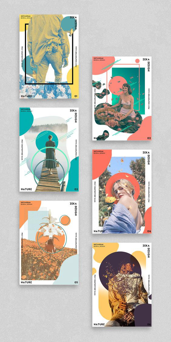
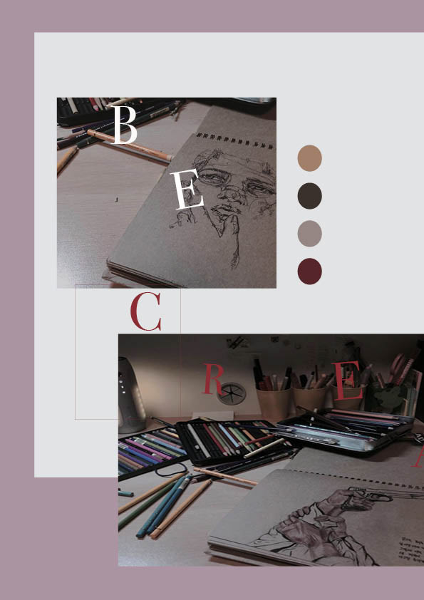
WK1| Workshop B
Concept book layout
photography workshop


Concept book sample layout
Reflect& Review
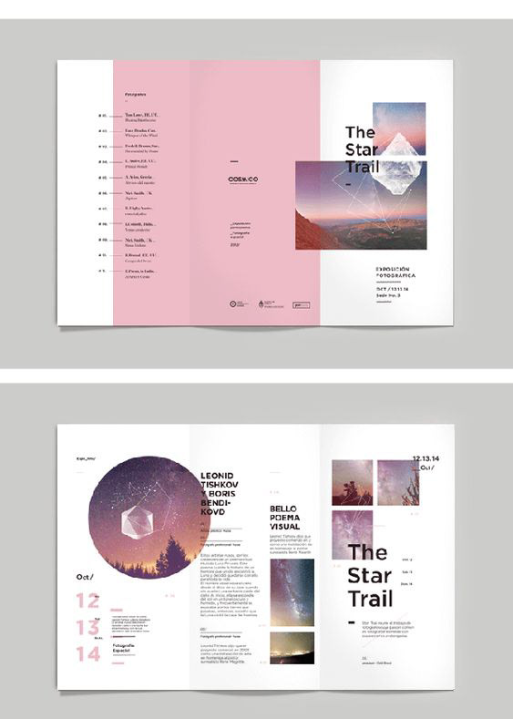

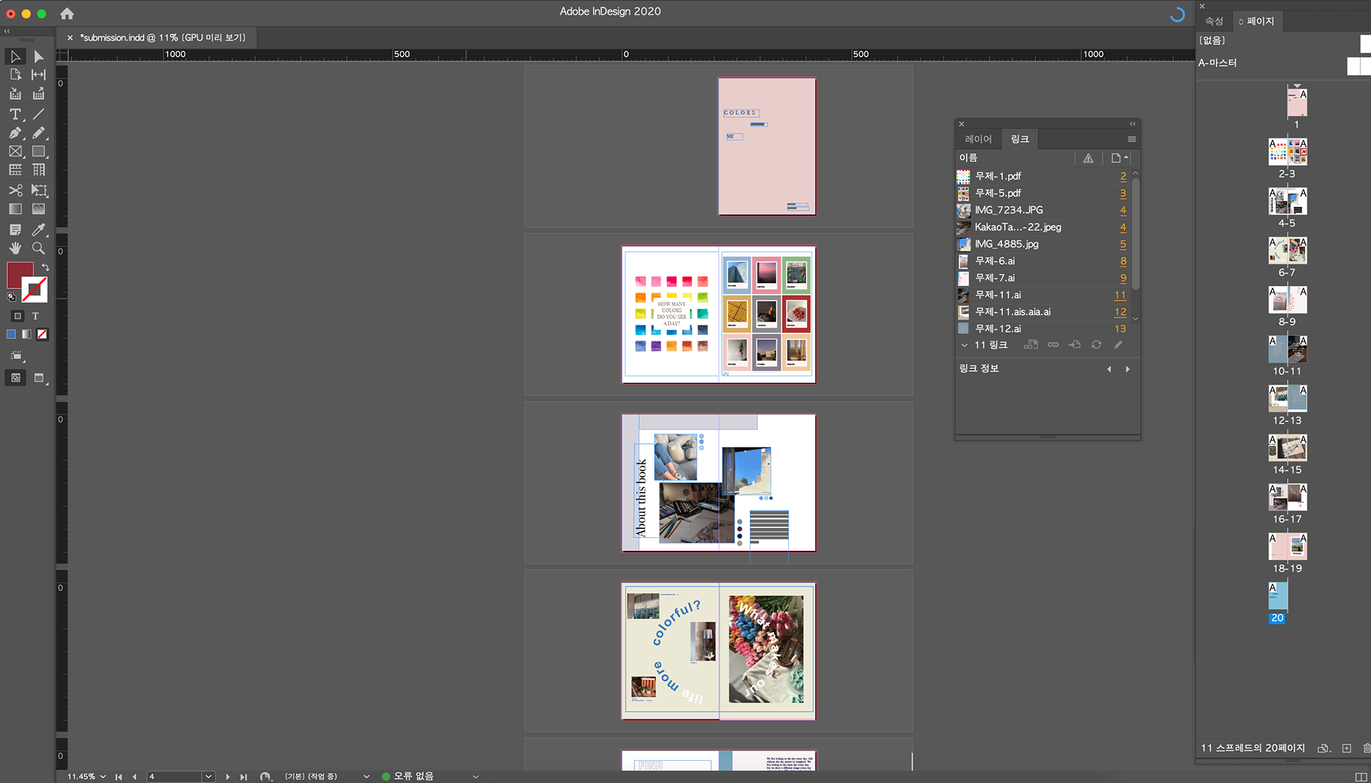
Shapes: Consider how using solid coloured shapes against a body of text / images adds emphasis.
: By inserting a semi-complementary blue photo on a pink background, the photo and the background are harmonized and the color of the photo is emphasized.
Heading: How does a heading text differ from the body of text and give it emphasis?
: Unlike general magazine titles and body composition, it is interesting to have a larger title and use a different font from the body and insert it in the middle of the body in a free manner.
Body text: Always make sure to use readable fonts for the body text,
: Separate the pages of text and photos so they can focus more on their respective fields. Pages composed only of text can become boring, but by inserting a title or subtitle in the center of the body in a large font, it has a visual effect and at the same time changes the monotonous composition to eliminate boredom.
Image: Using a nice large image makes design feel less cluttered.
: The photos composed of simple square frames rather than complex shapes form a sense of stability within one page of a magazine.
Background: Adding backgrounds / borders can elevate a page.
: I liked the composition so that the pink color of the background and the photo's blue color can blend naturally by increasing the image's transparency without inserting a particular background. And even if there was no special intervening element, only unifying the color of the background and the photo's color gave me a sense of stability within one screen.
WK2 | STUDIO A
Manifesto (your personal manifesto)
Your position as a designer
In a time when environmental issues are constantly emerging, it is necessary to be a fluid designer's attitude that can cope with nature and knows how to realize an organic design philosophy.
Your objectives and adjectives
As a visual designer, I want to be someone who starts design from a subtle and delicate point that ordinary designers cannot see.
What you hope to inform viewers is important about design from your point of view
I think important to constantly share and respect each other's thoughts and outcomes and to see, hear, and feel the methods from time to time. In addition, you should be aware that not only the way you are currently experiencing design nor the necessary abilities as a designer are applicable to everyone, but you should also consider yourself which abilities to further develop in which direction.
What you are passionate about
For me, design is the recognition of the world we live in through making objects or communication, and outstanding recognition or discovery gives me joy and pride as a human being who leads a life.
It should tell us about you as a designer and provide a glimpse into your personal life
It is important for designers to discover and develop their own inherent potential and to learn the ability to help others not only in the present but also in the future.
Concept Book Process book
WK2 | Workshop B
Idea generation Exercises
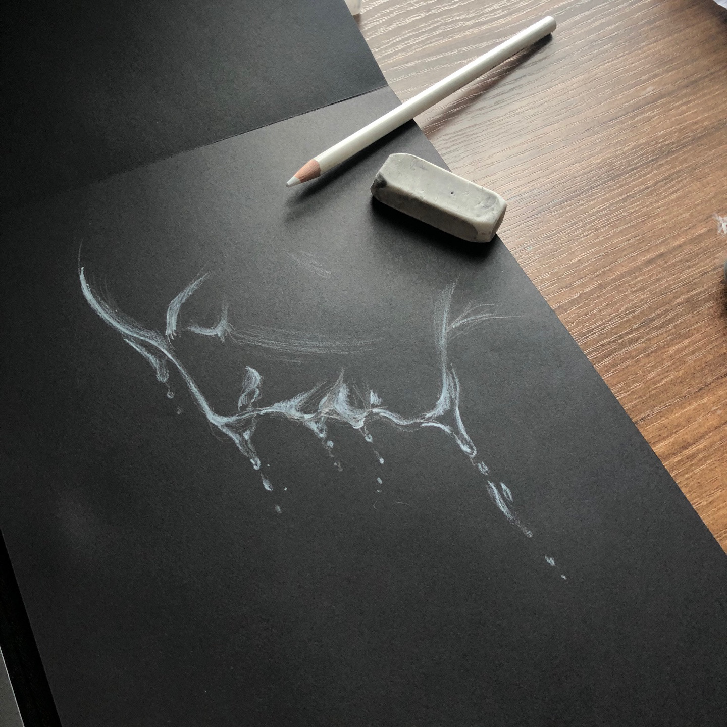
Iterative Sketching
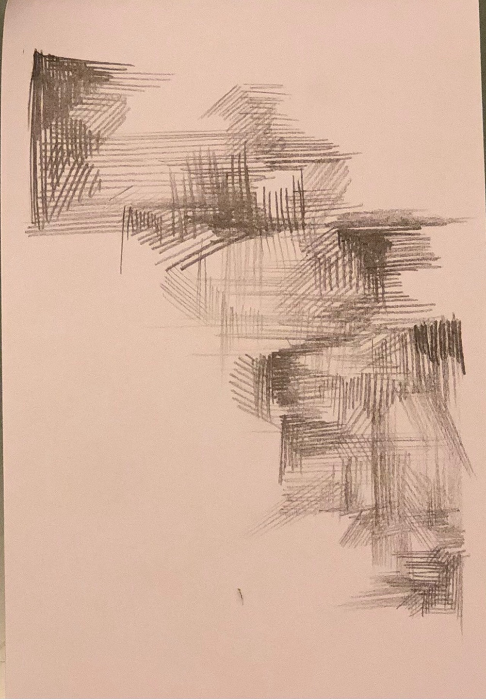
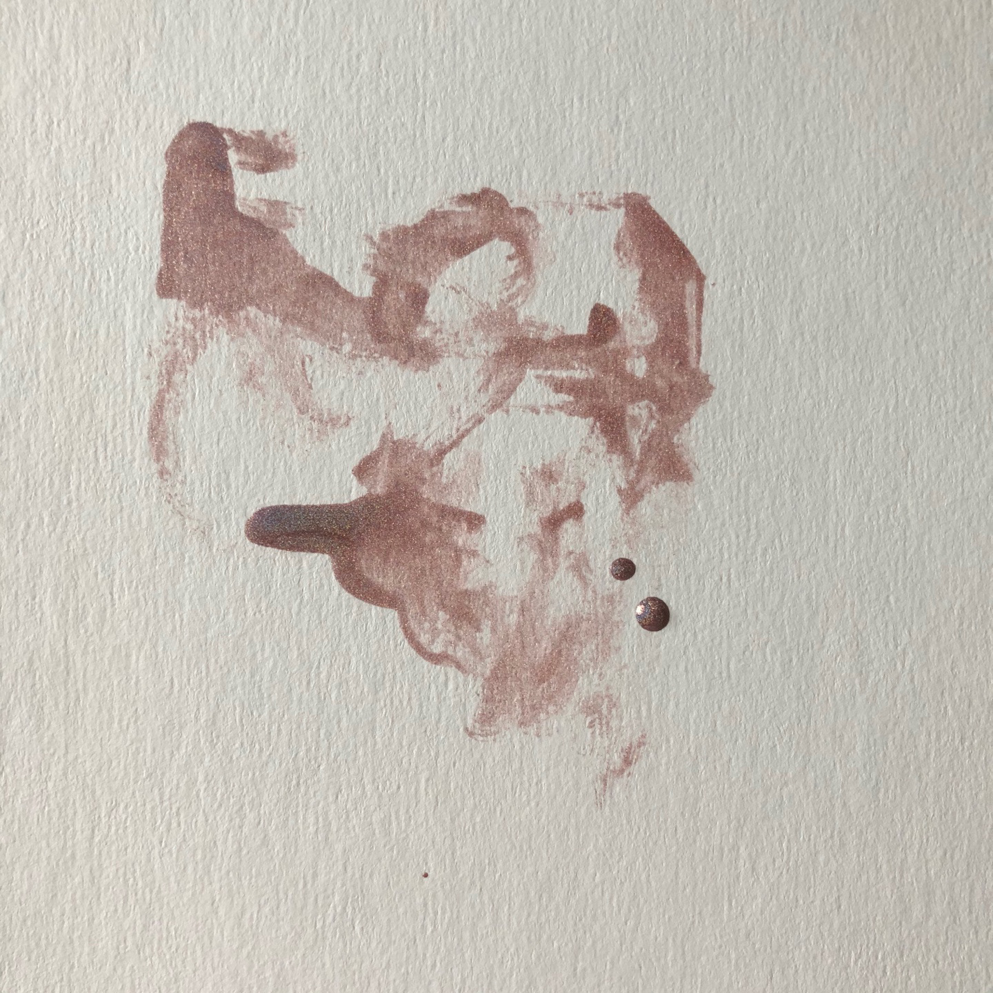
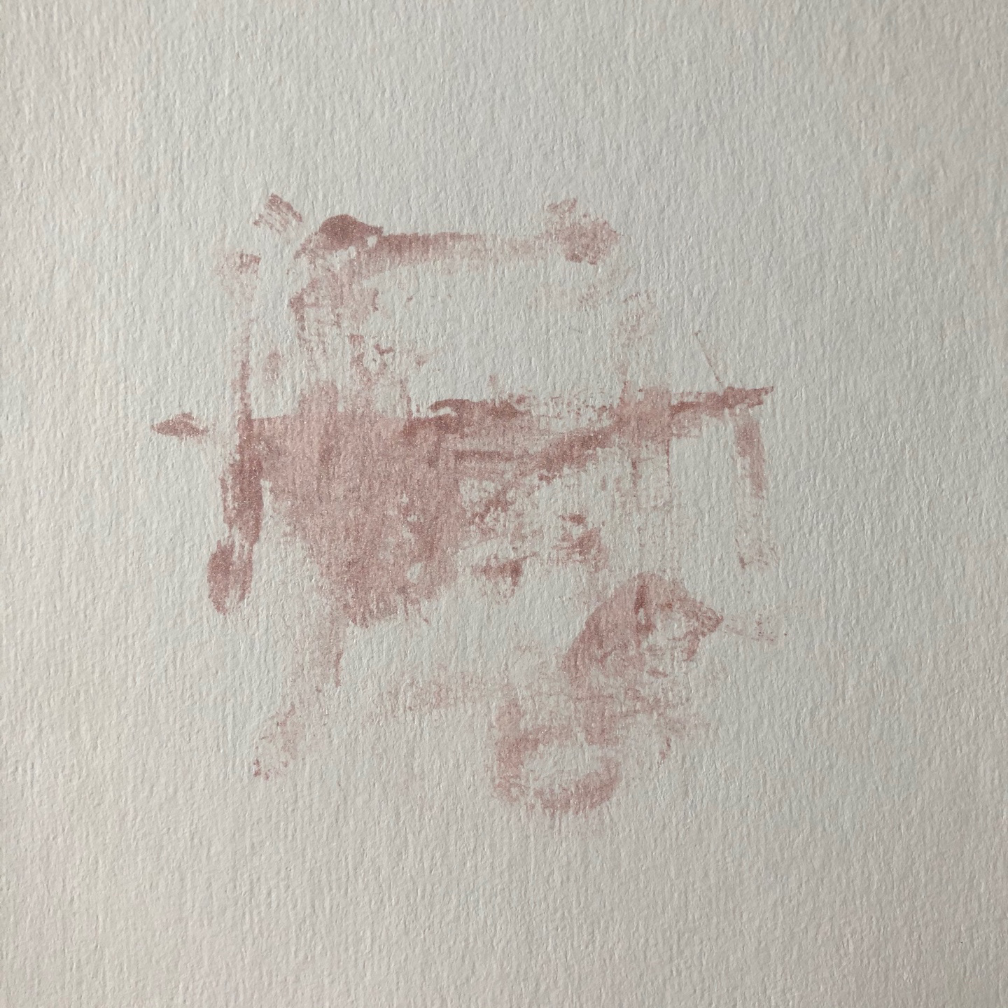
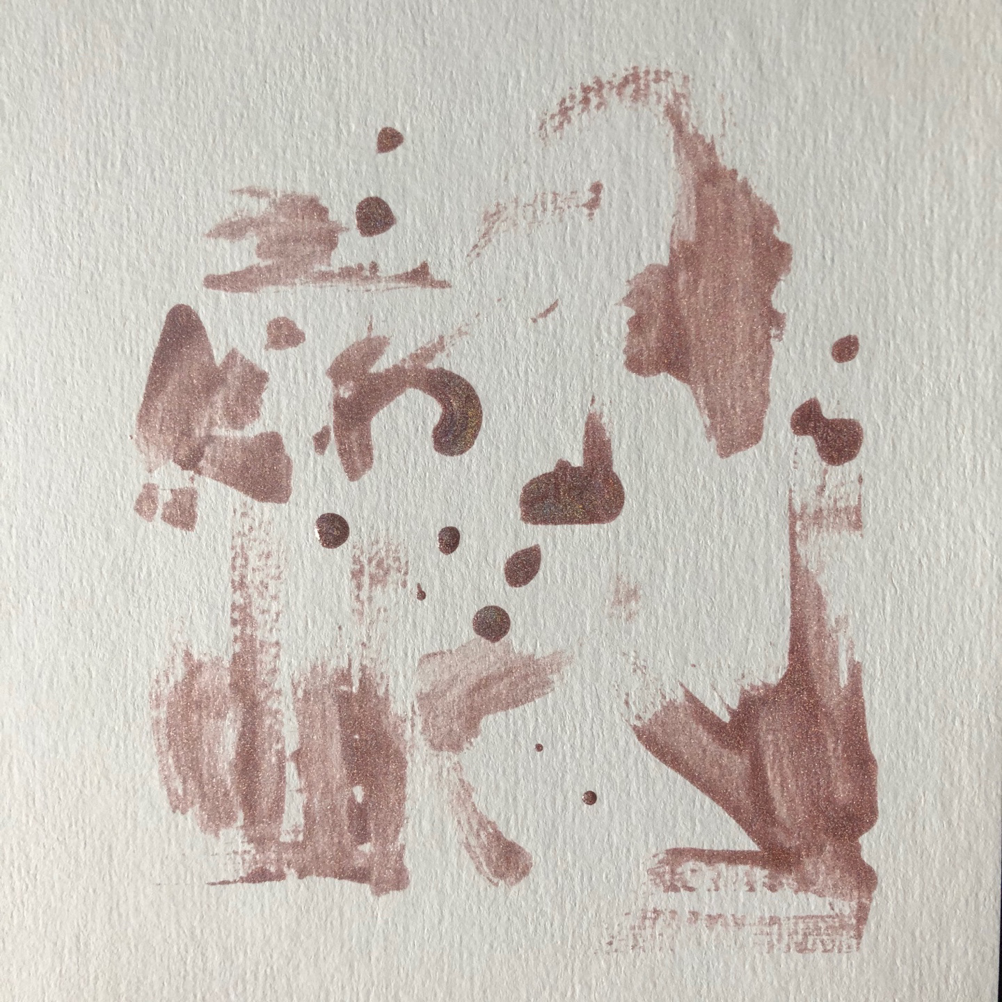
Mark making
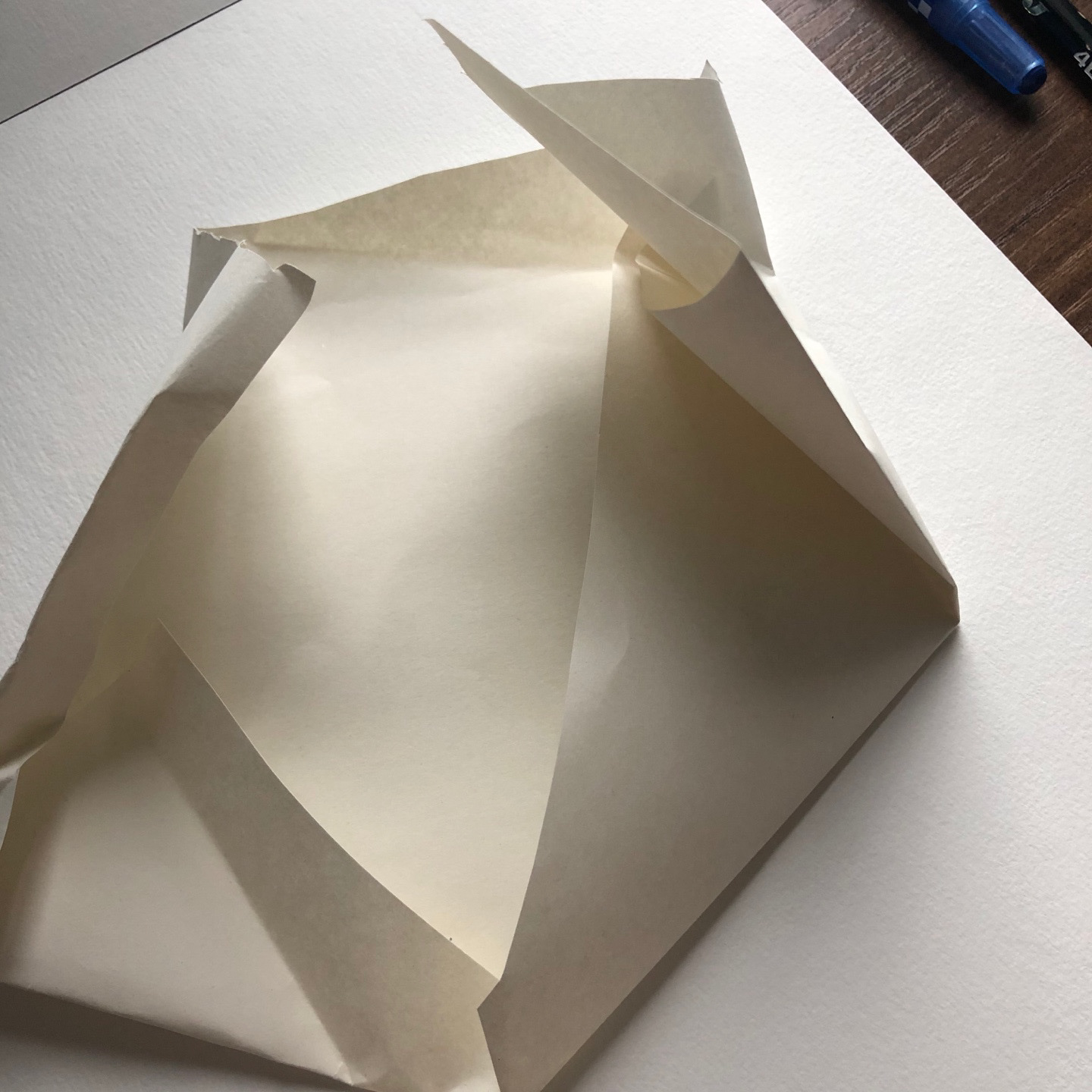
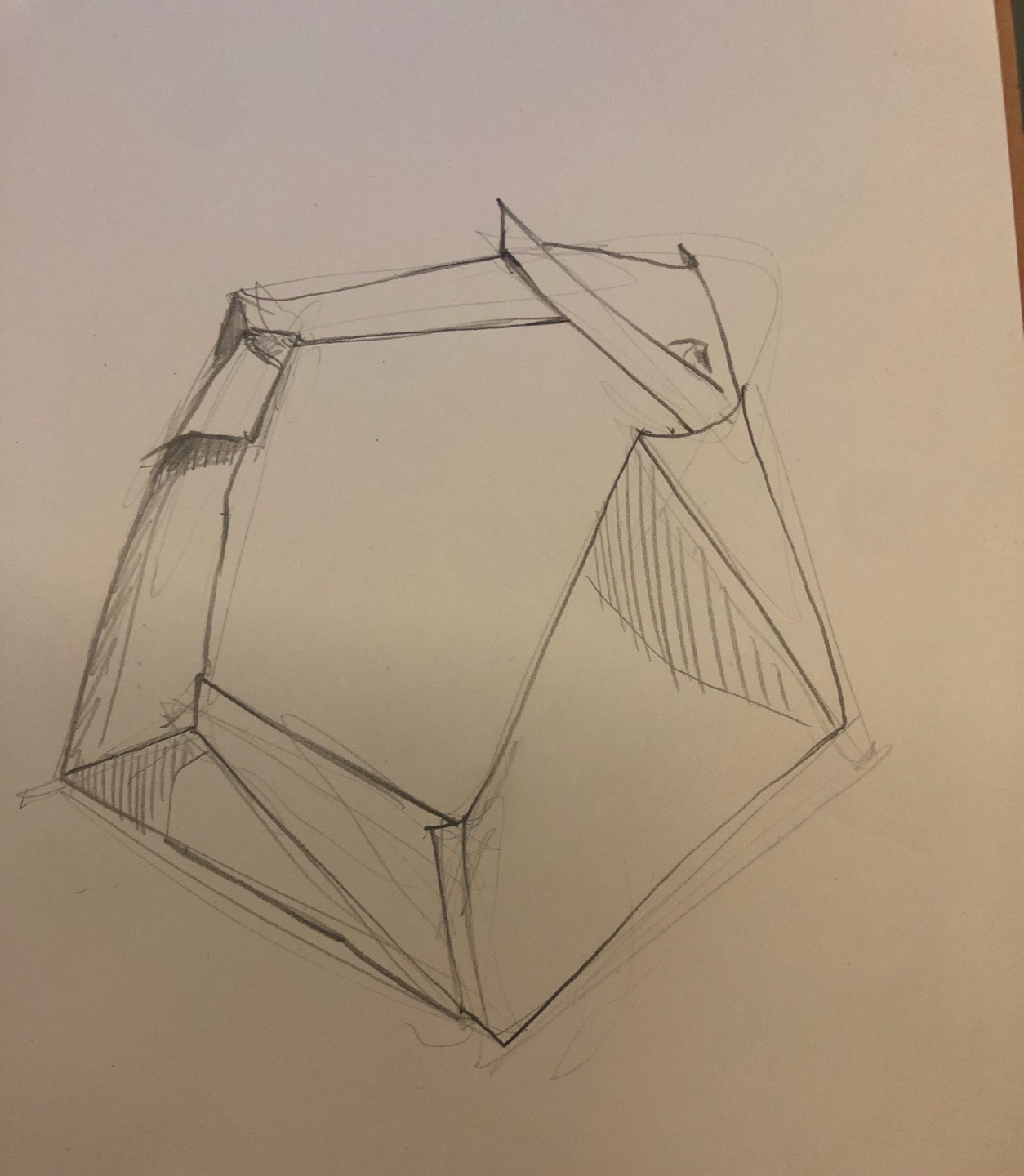
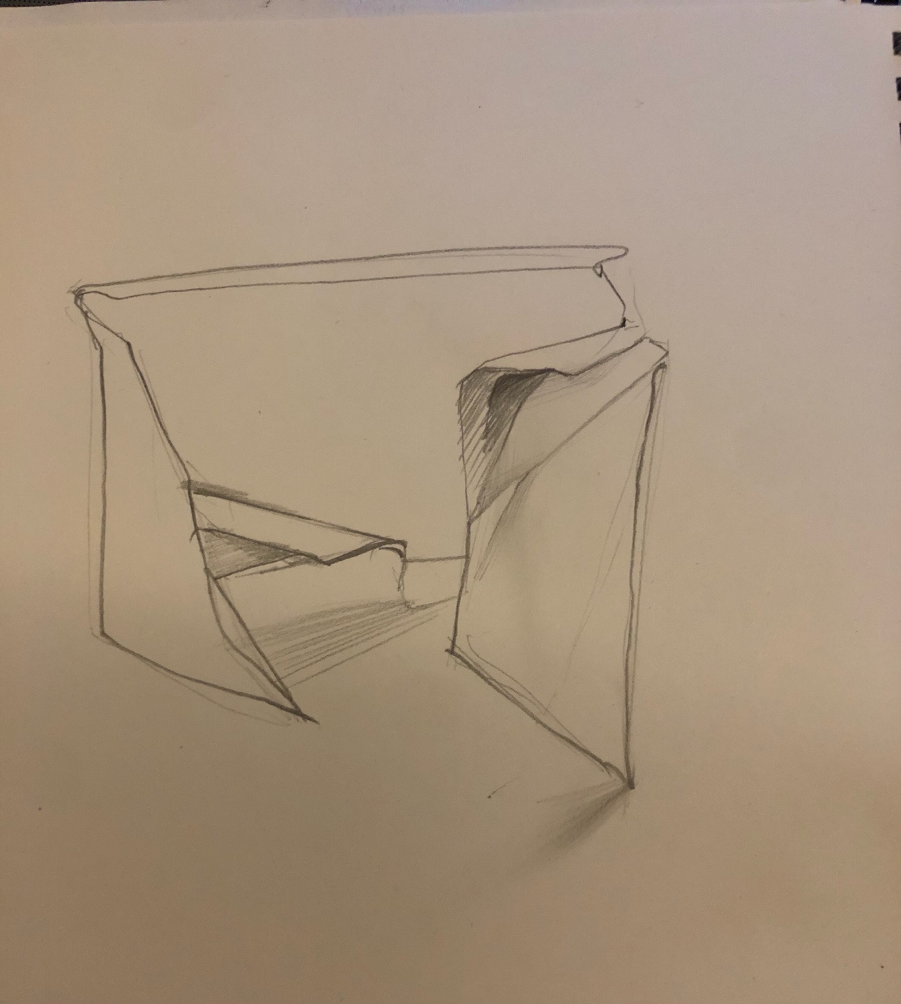
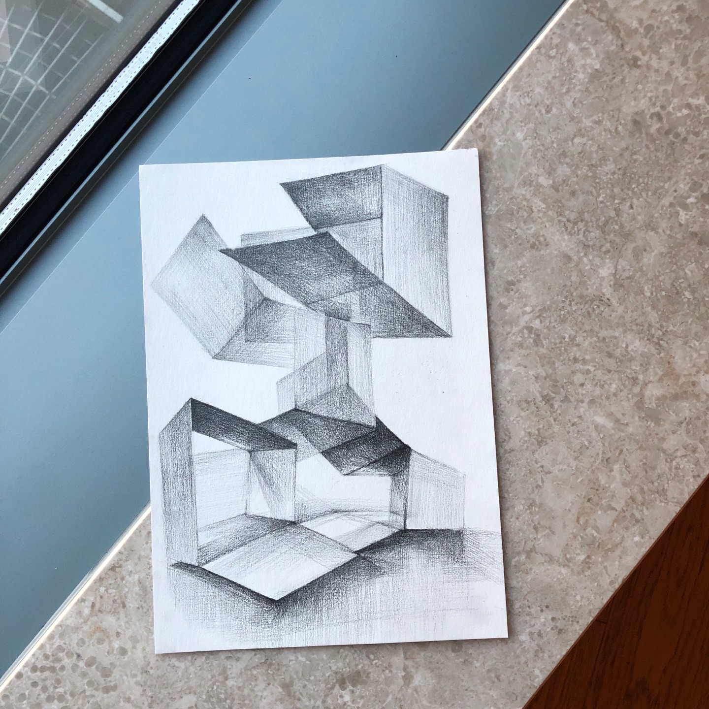
Sketching through Sculpture
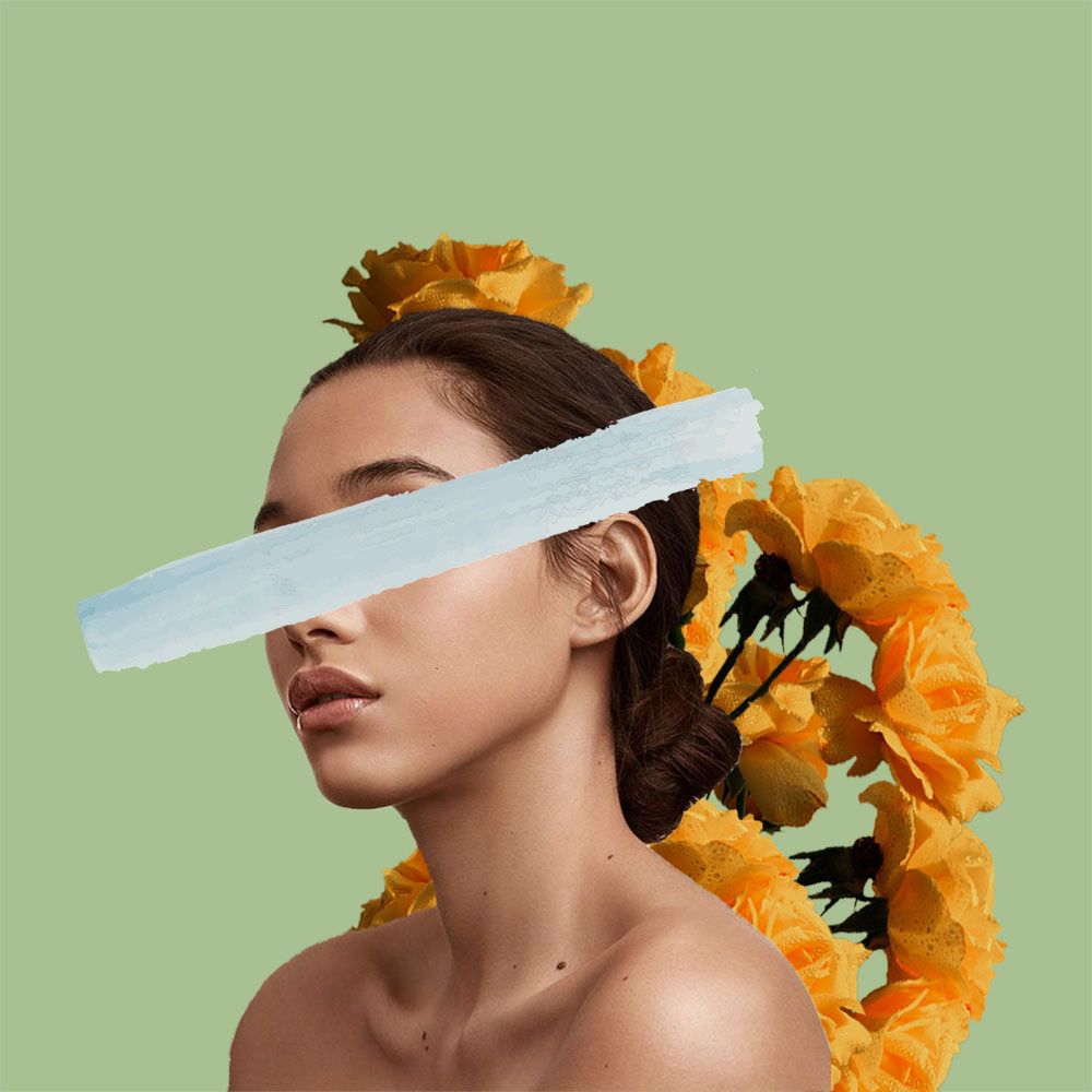
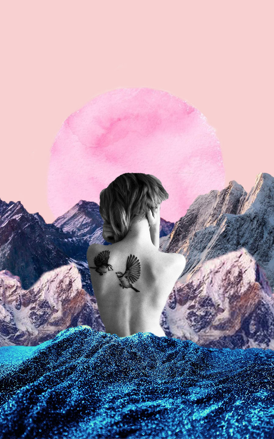
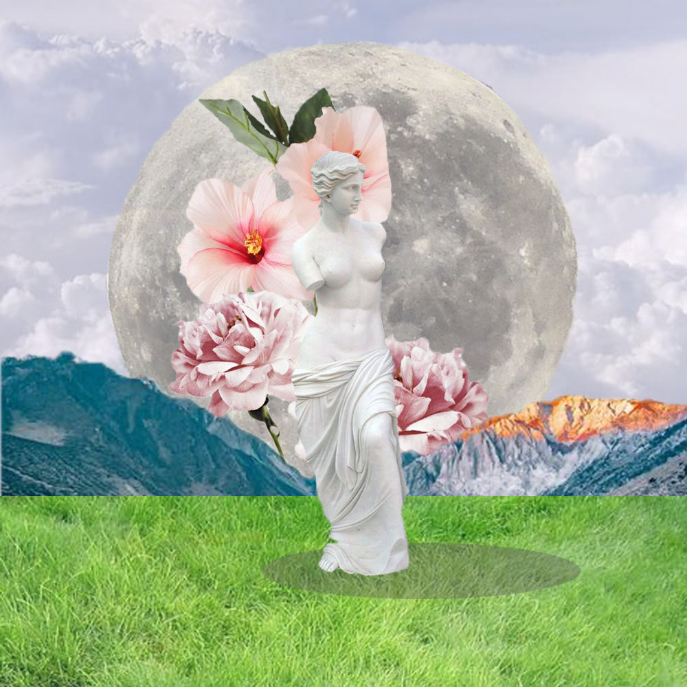
Collage (5 series)
WK 3 | Studio A
Still Life photography


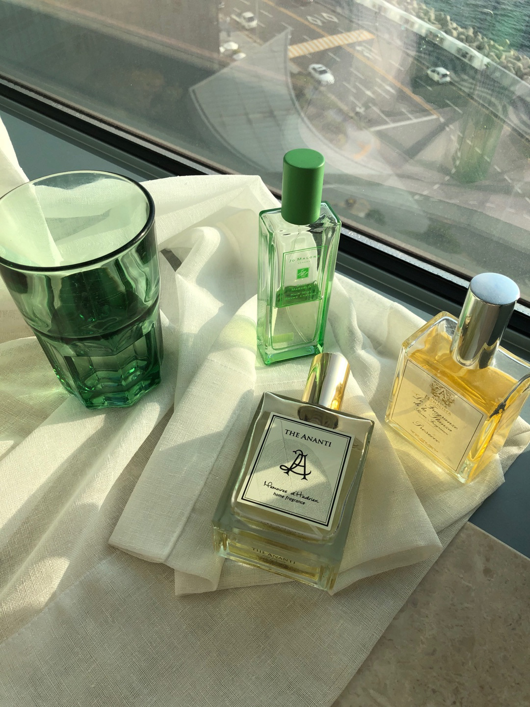
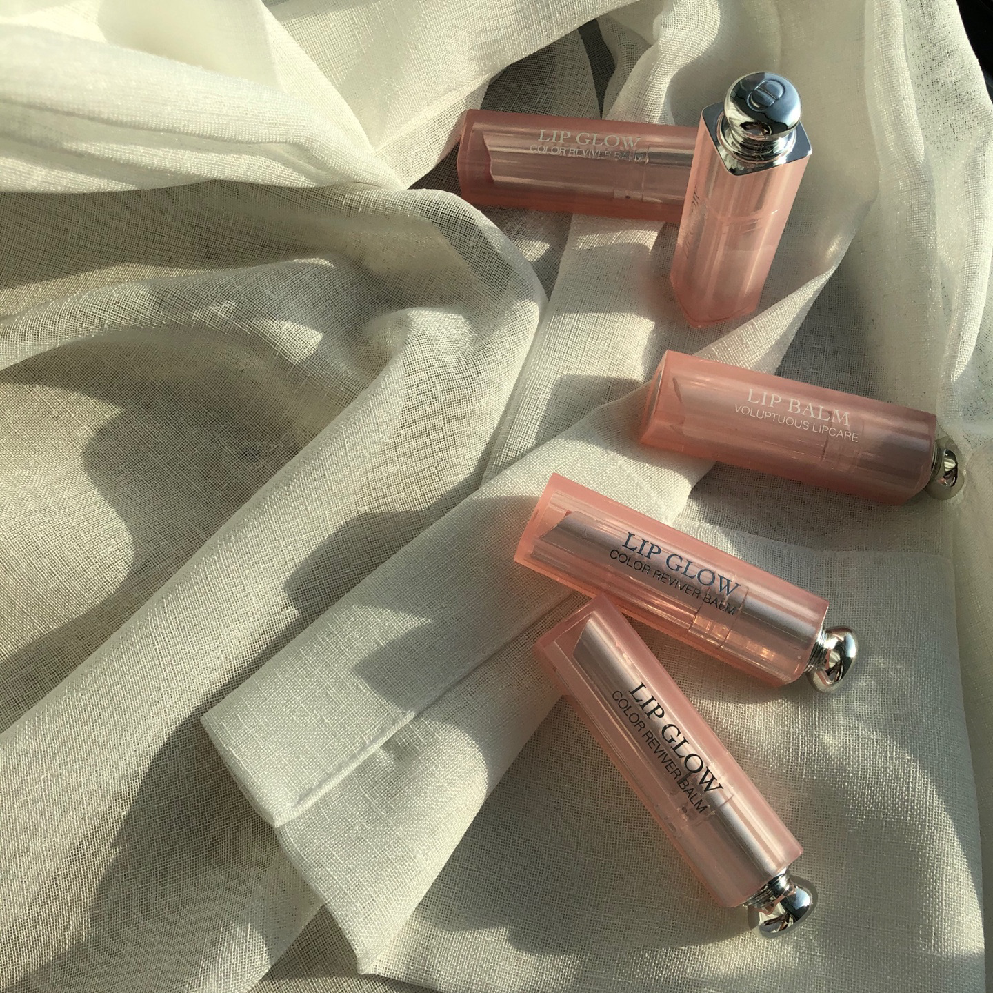
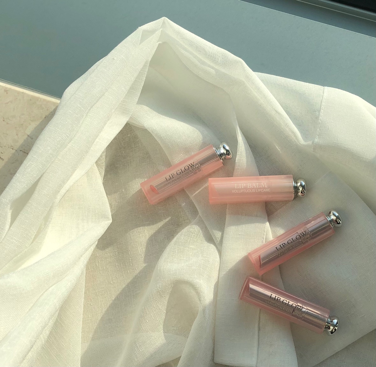
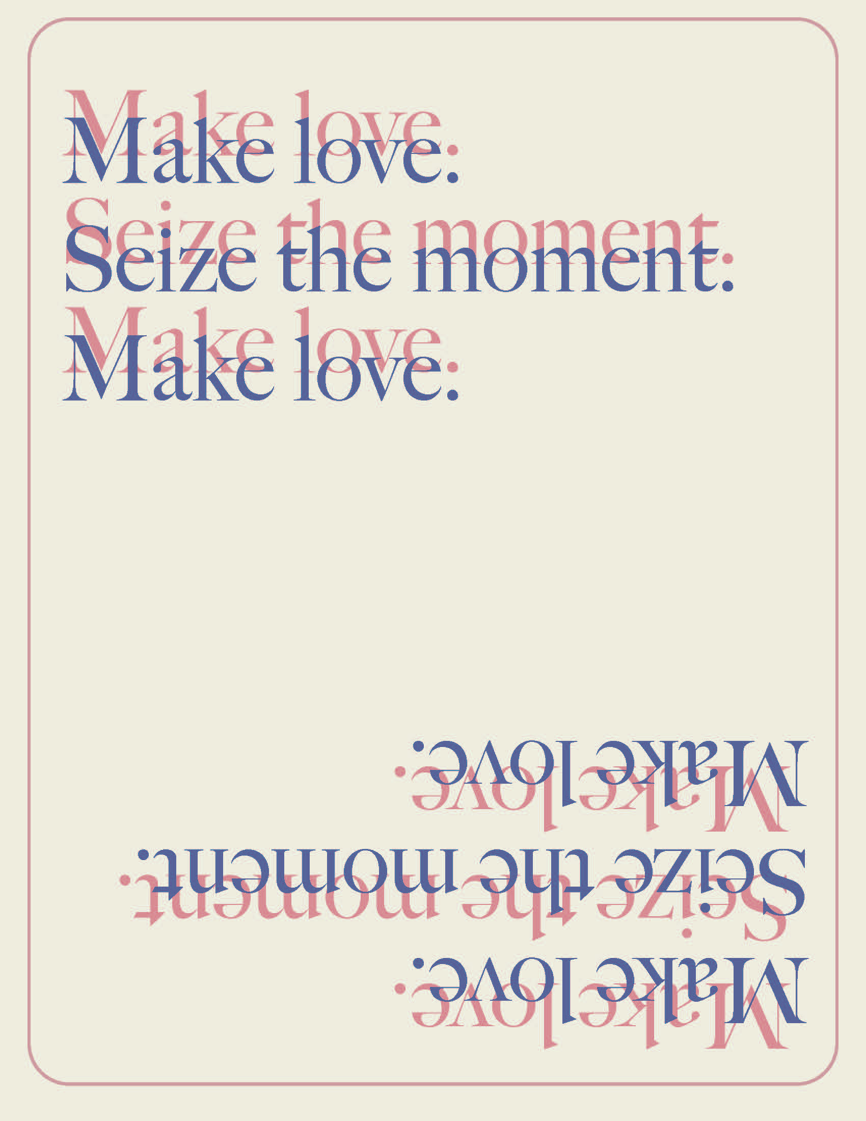
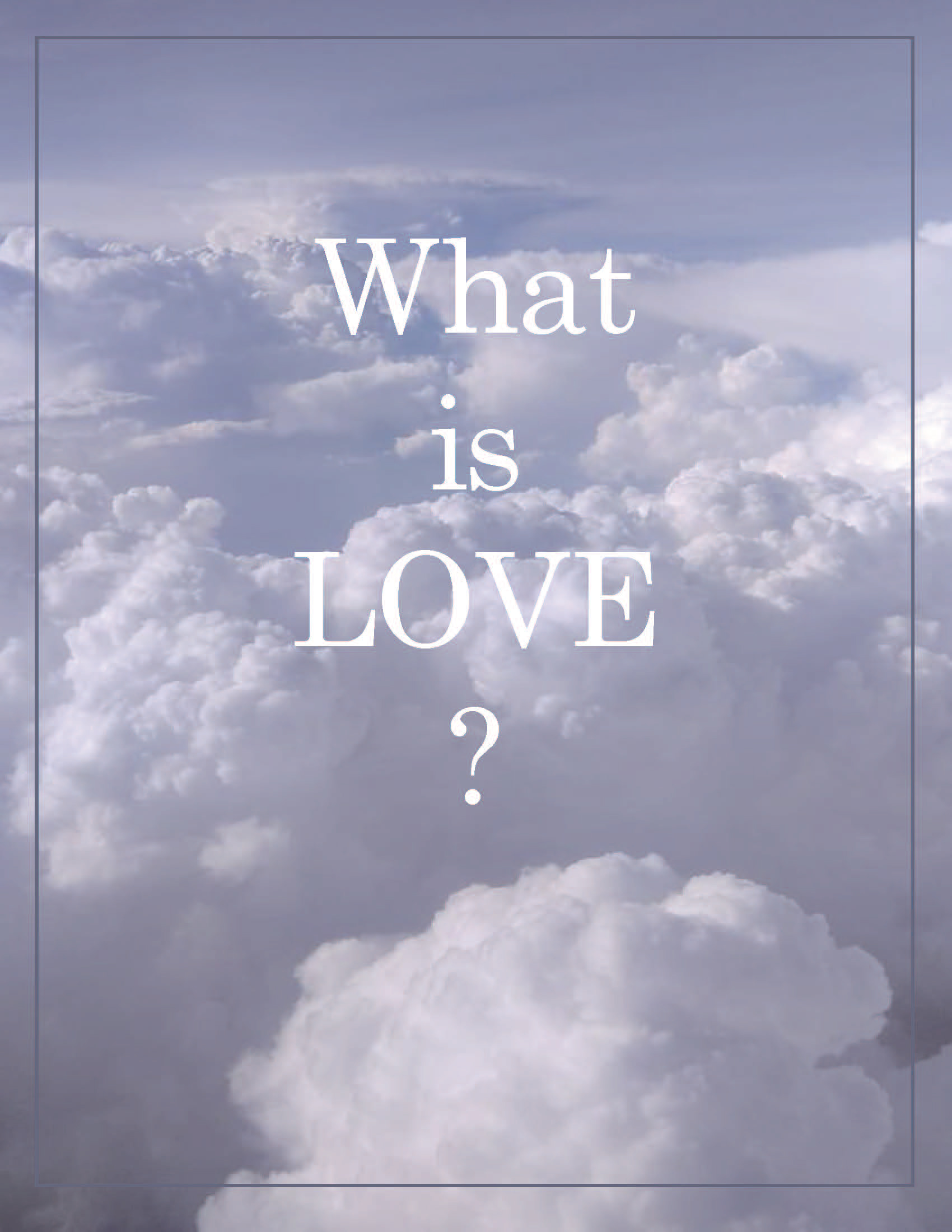
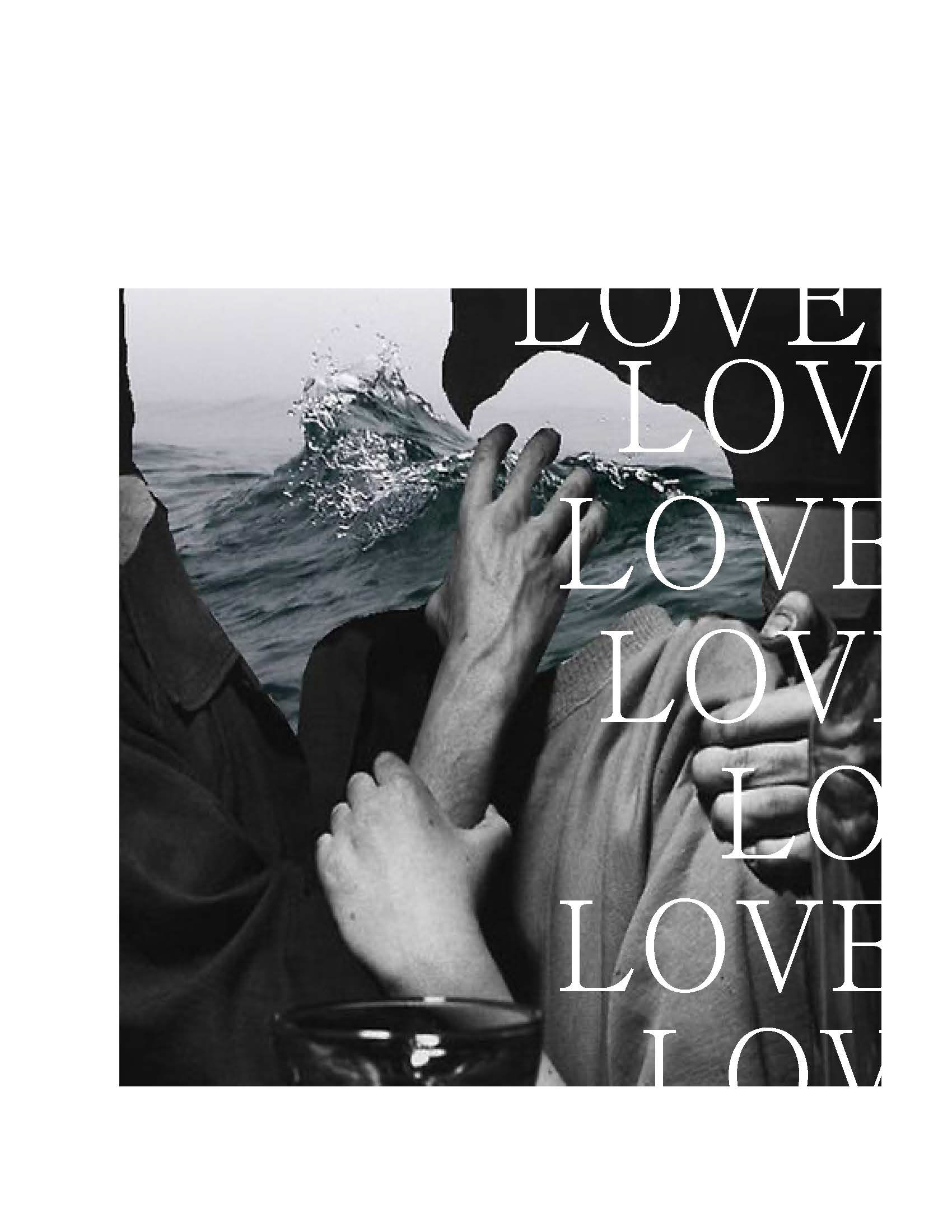
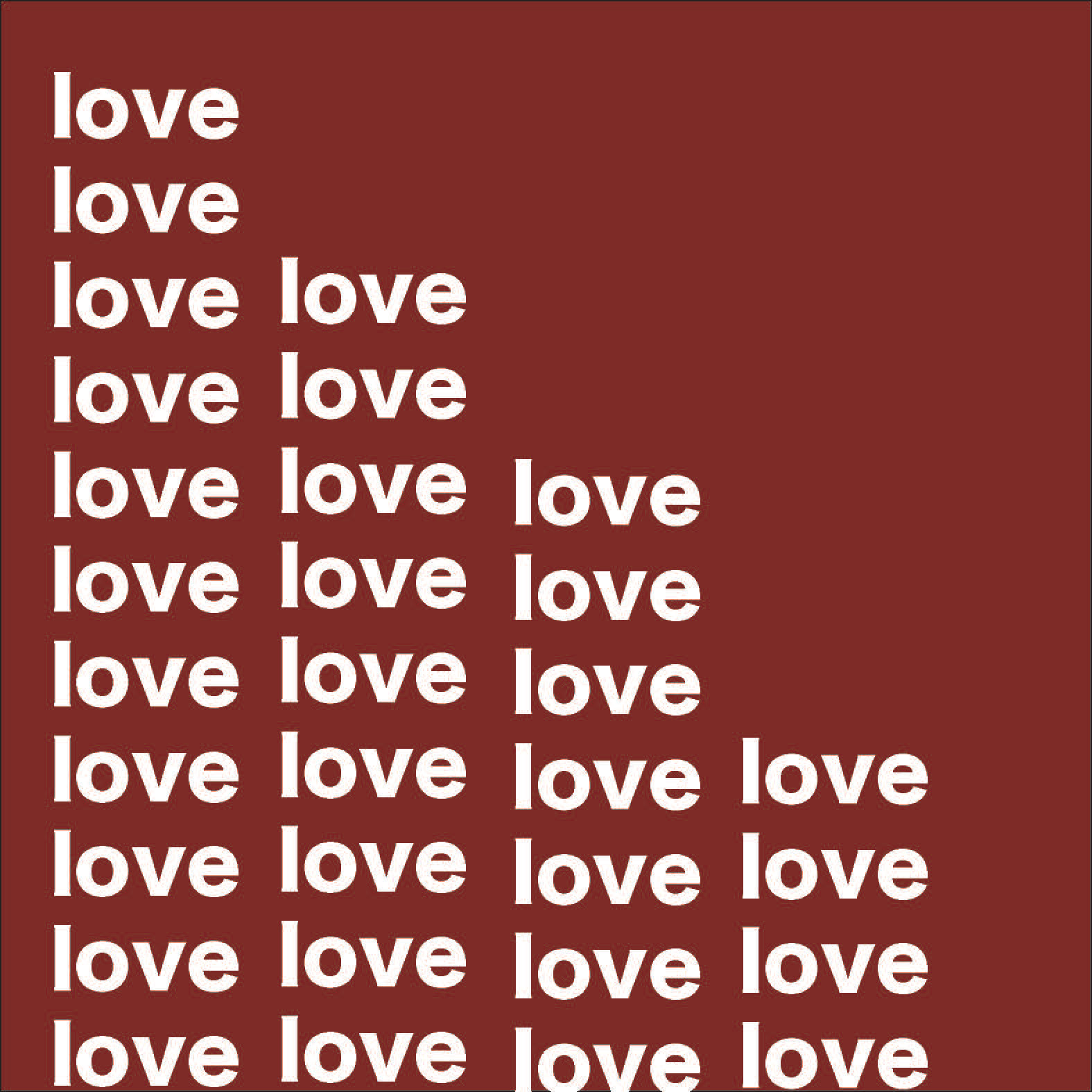
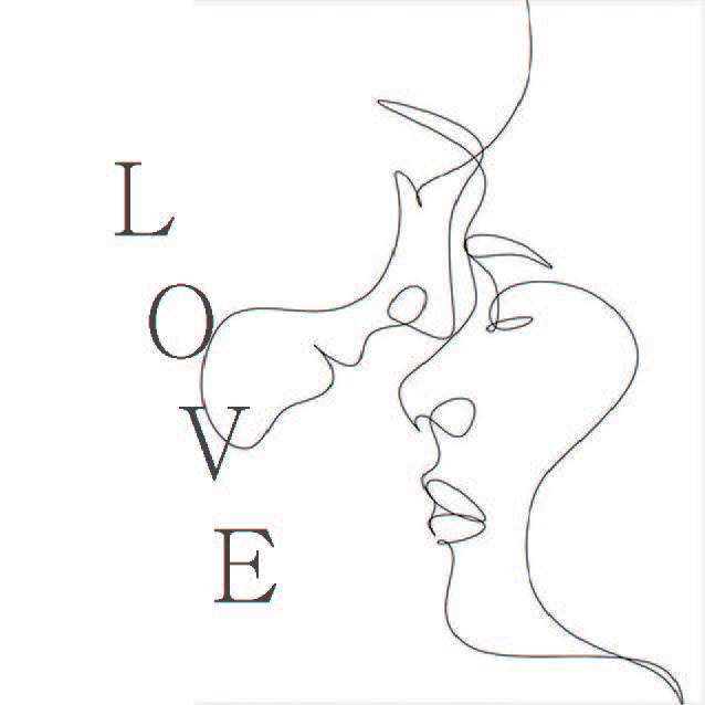
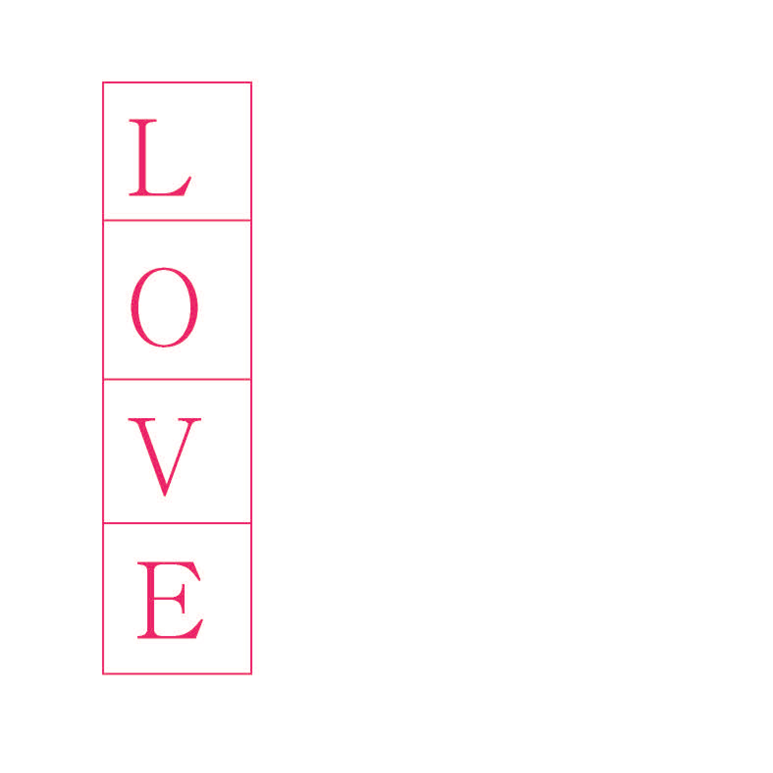
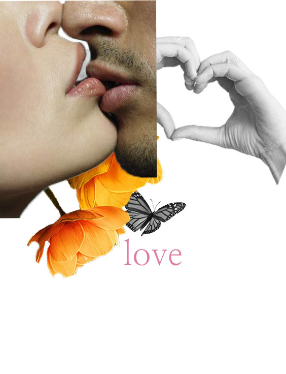
Image & Text (LOVE)
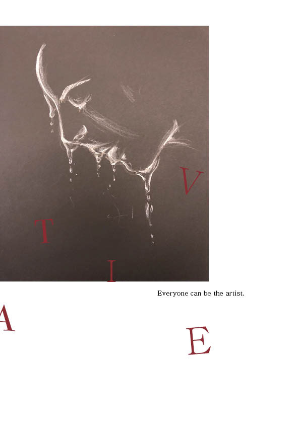
Final Concept Book
Reflection & Review
Just as I made a concept book by emphasizing colors, light and shadows in Project 1, I'm planning to focus on the color part in Project 2 and create a more complete result.